SecMon
Unlock the power of your E-Wallet while ensuring secure payments

Client /
Case Study
Role /
Product Designer/ UX Designer
Year /
2022 (4 weeks)
Introduction
SecMon is an e-wallet application designed to provide users with a secure and convenient way to send and manage payments. In this UX Case study, we will delve into the user experience design process undertaken for SecMon app. We will explore the challenges encountered during the design phase, the solutions implemented to address them, and the ultimate outcomes achieved.
Design Process
Project Overview
Competitive Analysis

Quantitative Research
Online Survey
To gain insights into the market and consumer preferences regarding e-banking and online shopping, we conducted online surveys involving 50 participants, employing quantitative research methods.
Target Audience
The interviews were conducted with participants ranging from their late 20s to early 30s to ensure coverage across a broad age spectrum. The participants came from diverse professional backgrounds, including Sales, Events, Marketing, Hospitality, and IT. It was important to include a variety of professions to gather insights from different perspectives. Additionally, all participants demonstrated a good understanding of smartphone usage and were active users of e-wallets and online payment methods.
Balancing Security and Usability
Challenge: Ensuring robust security measures without compromising user experience.
Solution: Integration of biometric authentication options for seamless and secure login.
Designing Intuitive Payment workflows
Challenge: Creating user-friendly payment processes for various scenarios.
Solution: Simplifying interface, reducing steps, providing clear instructions, and introductions, and introducing visual cues and personalized payment templates.
Building Trust
Challenge: Overcoming user concerns about the security of funds and personal data.
Solution: Employing a visually appealing design, displaying security badges and encryption indicators, and transparently communicating security measures and privacy policy.

Affinity Diagram
With a good amount of data in hand, I grouped and organised the information in an affinity diagram. Here are some of the findings:

Persona
After gathering and organizing the research data, the next step was to create a persona that represents the target audience for the interviews. This persona served as a valuable tool to concentrate on addressing the significant challenges and meeting the primary needs of the most crucial user groups. While the persona is fictional, it was developed in a realistic manner, incorporating characteristics and behaviors observed during the research phase.


Customer Journey Map
We are currently immersing ourselves in Stasy perspective to understand his experience with communication apps during a typical workday. By creating a User Journey Map, we gain insights into Stasy interactions, pain points, and the steps she takes to address them. This map enables us to visualize the challenges she faces and the strategies she employs to overcome them.

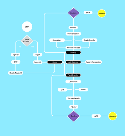
User Flow Diagram
We are now putting ourselves into Stasy's shoes and walk with him through a booking process. We are noting the following. A few opportunities arise from this process to improve experience:

Low-Fidelity Wireframe
With the key features and user flow defined , I started to capture my ideas by sketching low-fidelity screens using Figma, It enabled me to examine my ideas before moving onto High Fidelity wireframes.

Mid-Fidelity Wireframe
Once I had a visual direction for the app layout, I started to add more details and precisions to the sketches by turning them into mid-fidelity wireframes. In these wireframes, I included elements that directly address users' goals, needs.


.png)
High-Fidelity Wireframe
Once I had a visual direction for the app layout, I started to add more details and precisions to the Mid -fidelity prototypes by turning them into high-fidelity wireframes. In these wireframes, I included elements that directly address users' goals, needs, frustrations while incorporating common design patterns seen in other communication apps.
